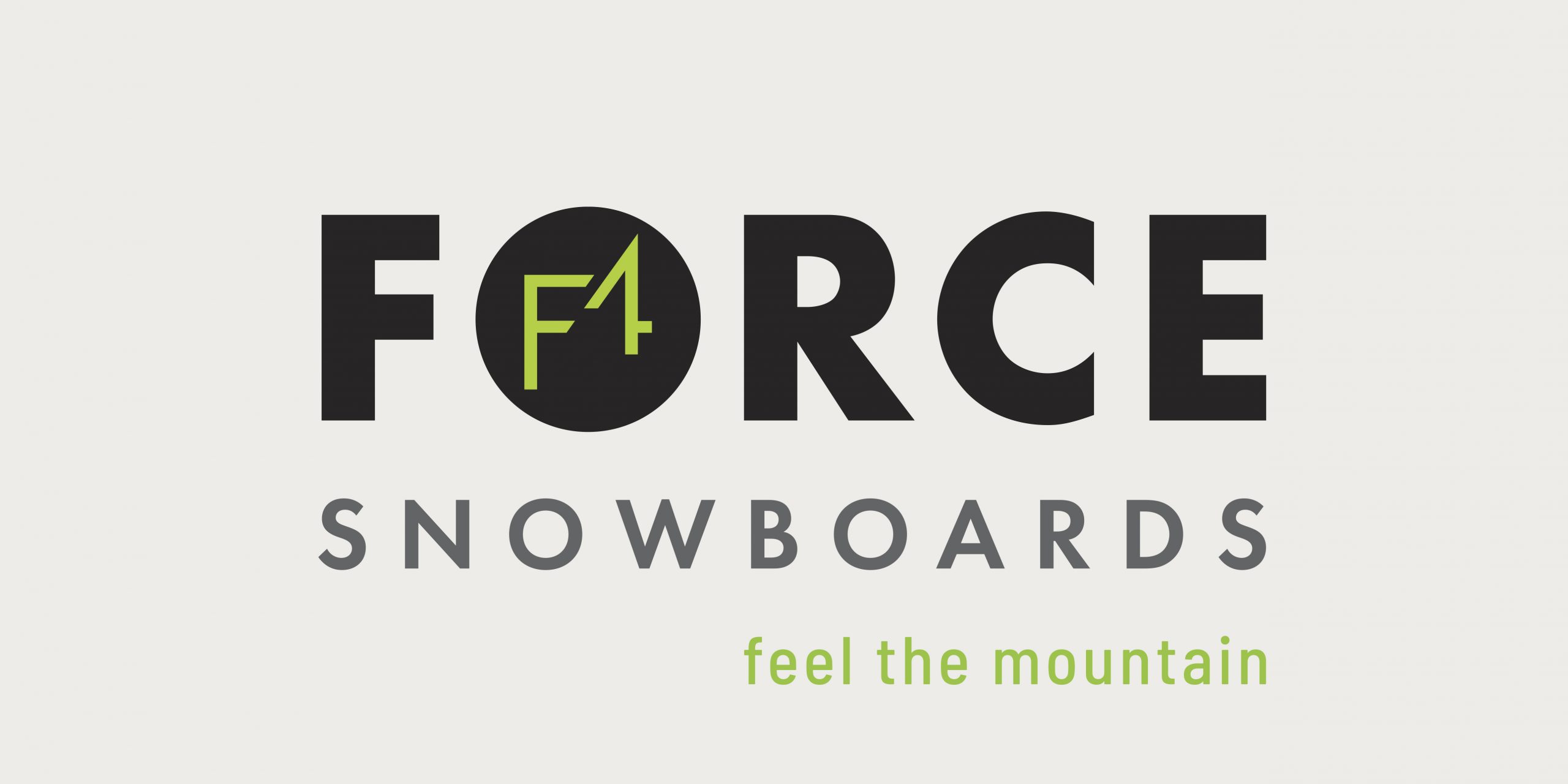
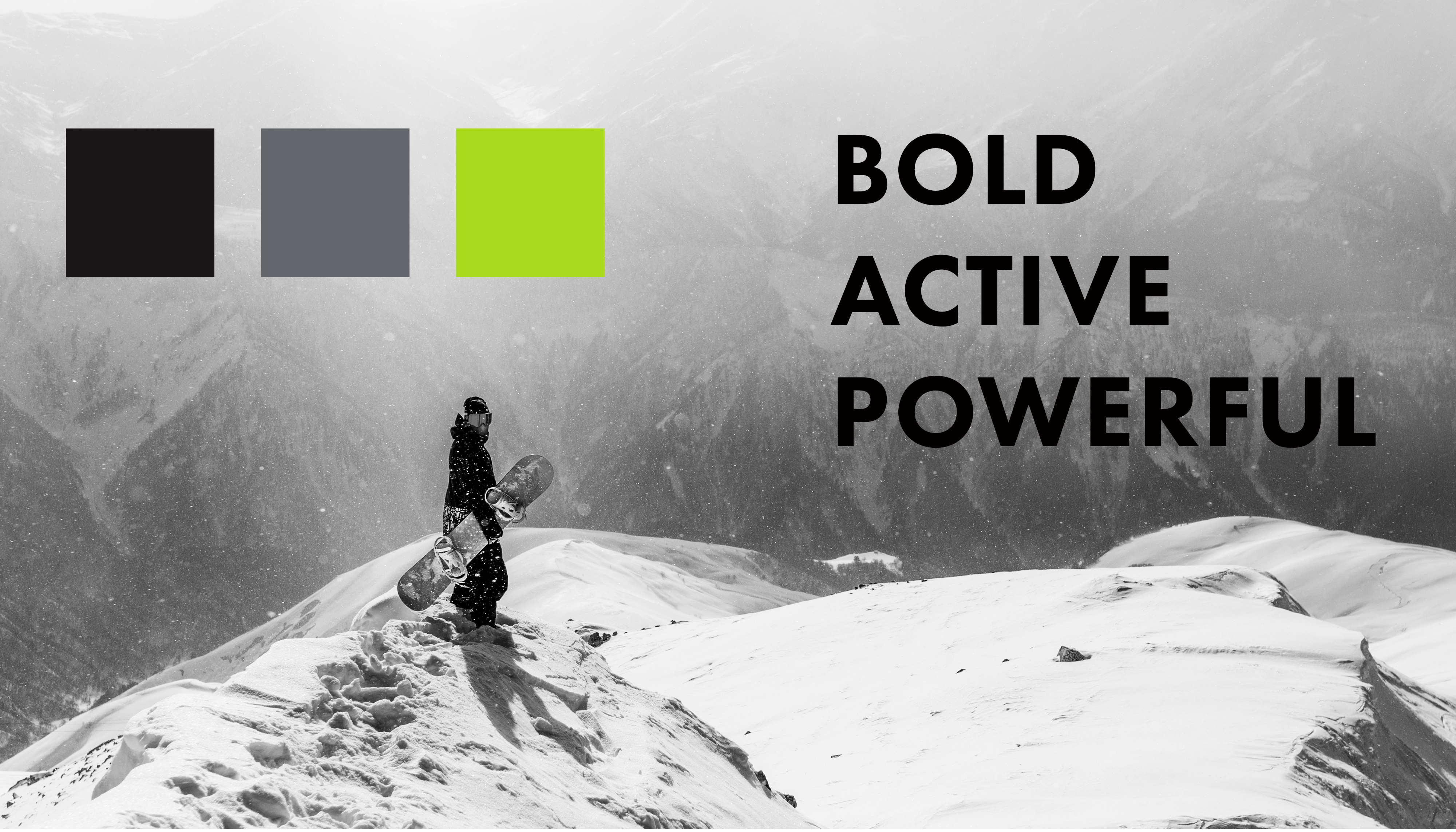
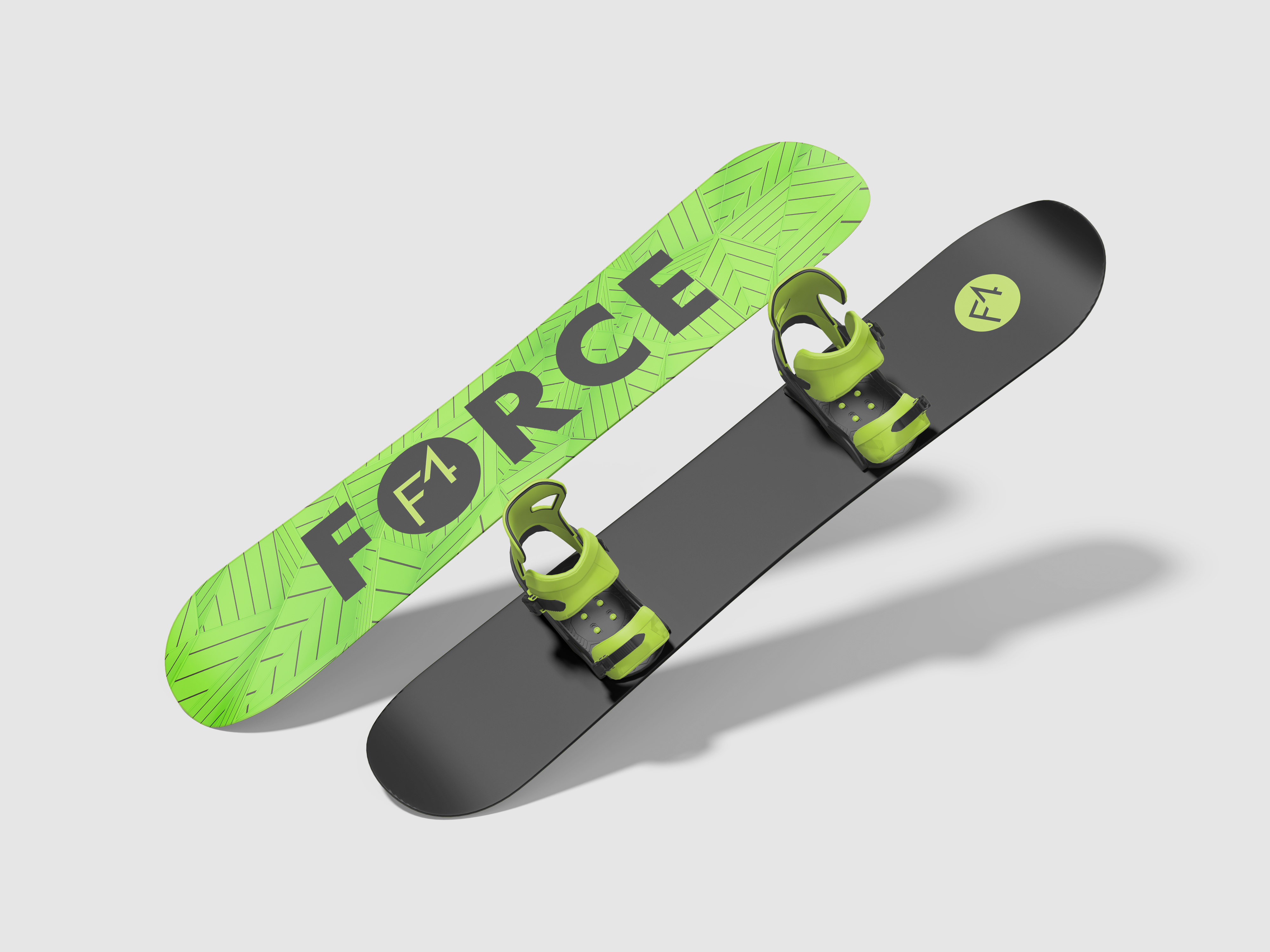
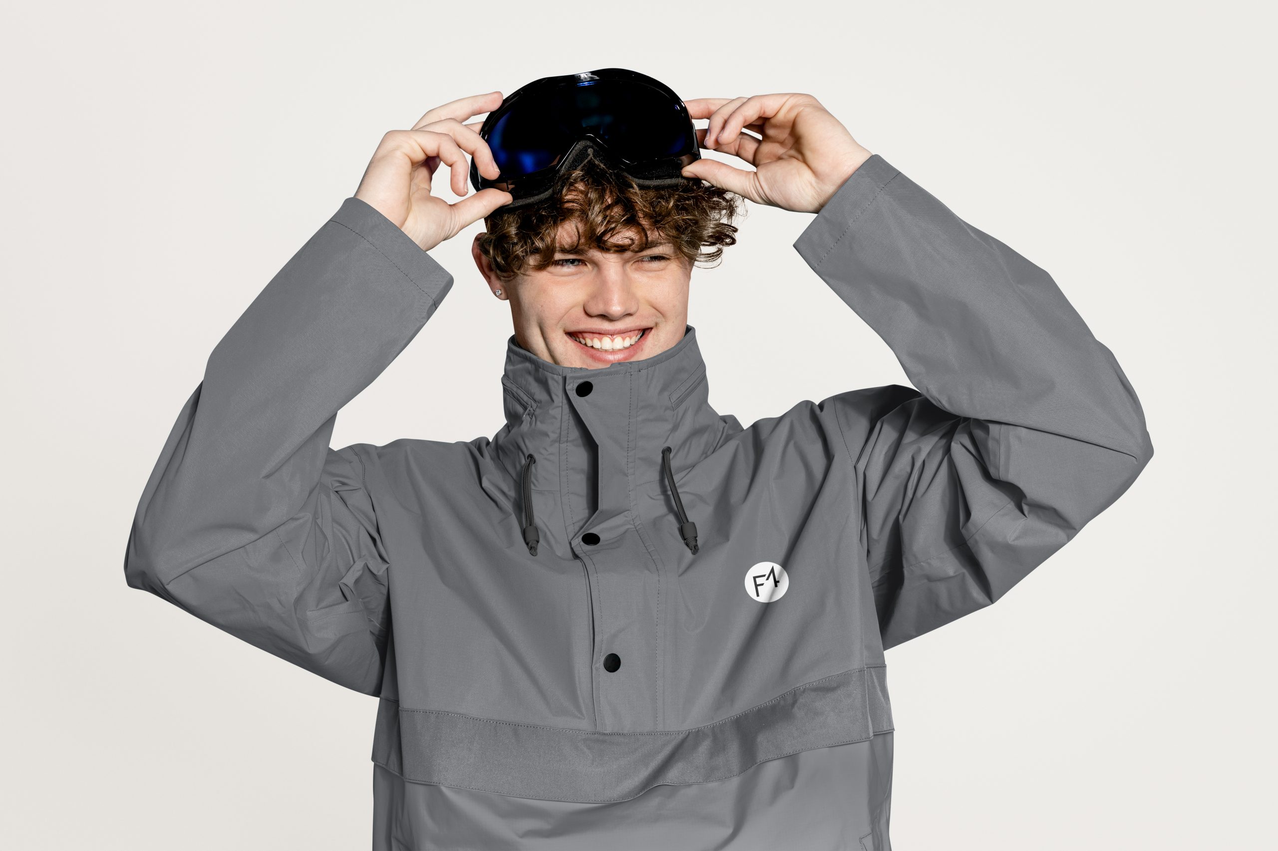
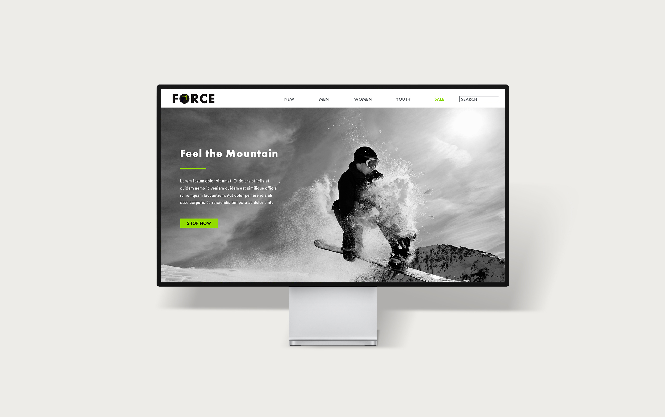
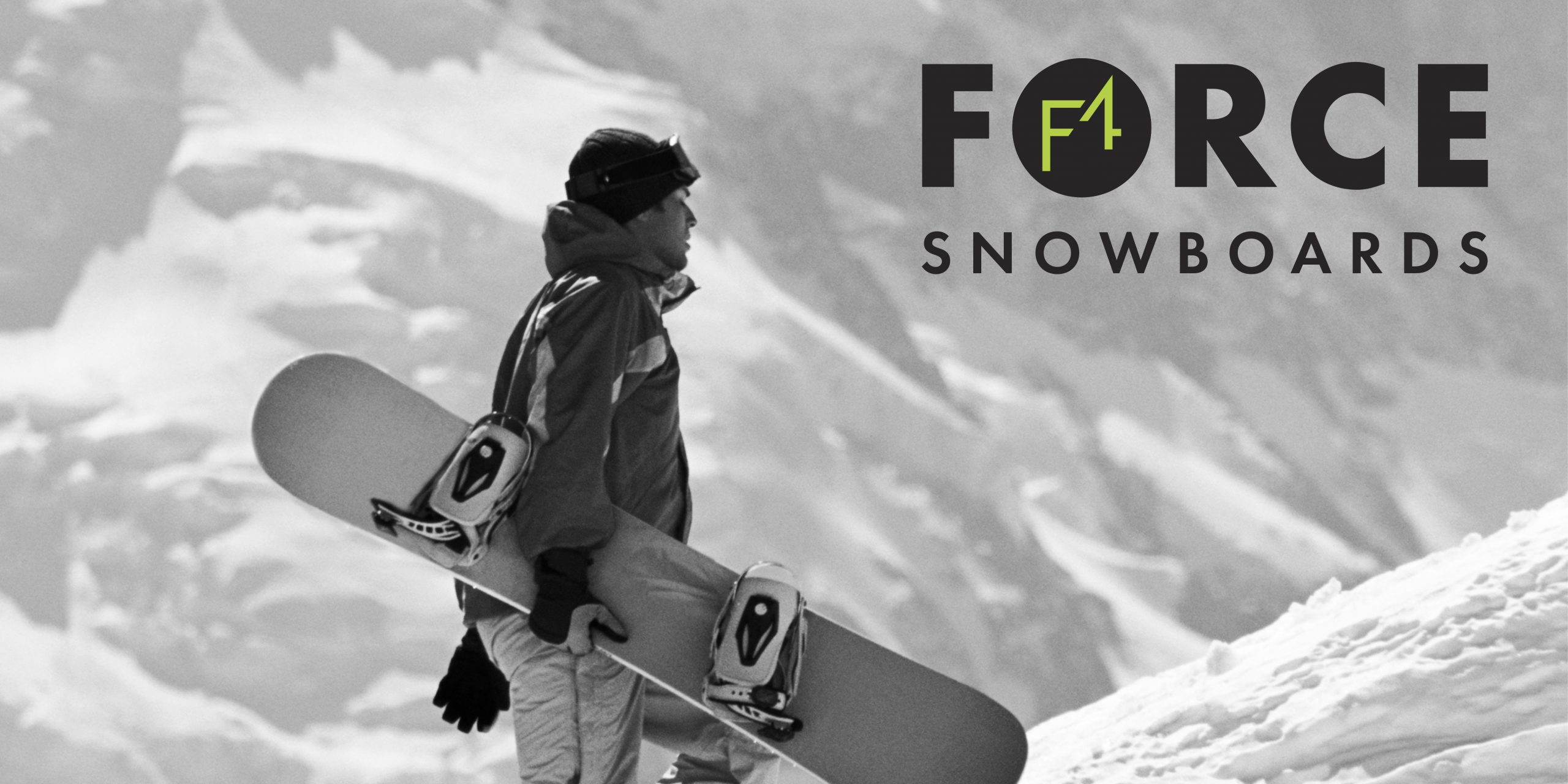
FORCE is a simple yet striking brand designed to inspire the inner adventurer. Bold colors and sleek typography create an active, high-energy feel, while the name itself invites snowboarders to tap into the power and intensity of the mountain.
Date: Summer 2025
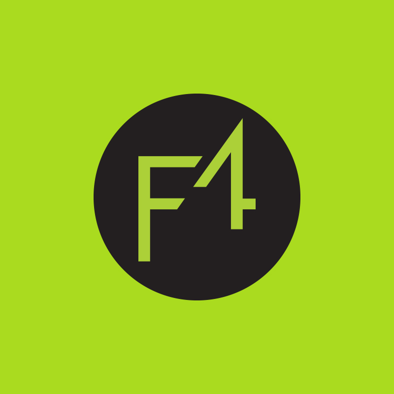
This project began with the characters “F” and “4,” which served as the foundation for the logo and overall brand identity. The logo was intentionally designed to be simple and versatile. After exploring potential industries, the snowboard industry emerged as the best fit. From there, logo signatures were developed and a bold color palette was explored—chosen to convey energy and a sense of force.
I would love to connect with you on any projects you may have or creative ideas you have rattling around in your brain. Collaboration is my favorite! Please email me at [email protected] and I will be in touch shortly.